Hangry’s Food Truck
Supporting a local food truck.. one to-go order at a time.
“Feels like I’m helping a small business instead of just dumping more money in to a McDonald’s.”
Project Background
Challenge: Develop a checkout experience for customers of Hangry's food truck.
Deliverables: User research, Persona, User flows, Journey mapping, Wireframes, UI, Usability studies, Full fidelity mockups.
Role: User Researcher, Product Designer.
Tools: Figma, Keynote, Procreate, Google Forms, Microsoft Excel, FigJam.
Duration: 6 months.
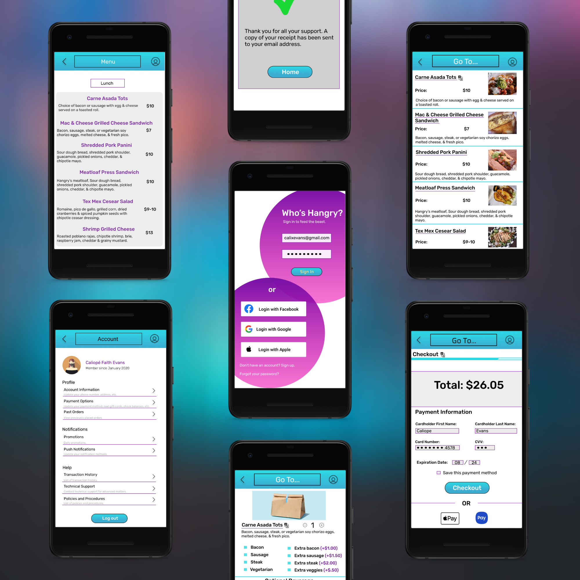
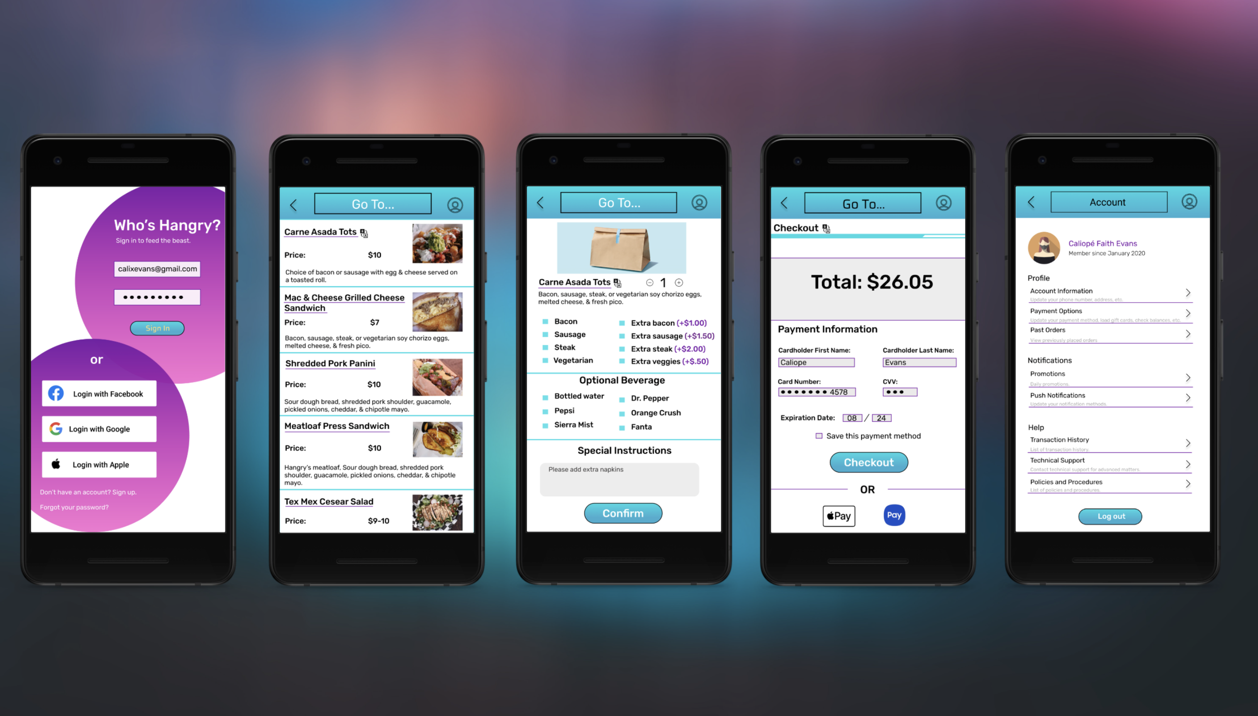
I created a responsive mobile application that allows users to perform and access tasks all within one place, without having people waste their time by cross referencing different websites and social media accounts. The features below were also added to encourage more business to the local truck.
Allow users to see the menu as well as place and customize orders.
These features are important because they allow people to be able to understand what they are getting and place orders ahead of time, thus saving time and creating a more efficient process of obtaining food.
Give users the ability to use different payment options than just cash.
Cash is extremely limiting for some people-- not everyone carries it. So it can be not only damaging for a business, but easy for people to become frustrated and dismiss the establishment as a viable food option.
Allow users to see the food trucks location.
Being able to view a food truck's location is beneficial for both parties, consumers and the business, by increasing foot traffic.
Hangry's is a local food truck that lacks a sole information and task completion hub. The establishment lacks a source where users can easily access both vital information and the ability to complete tasks such as successfully seeing the menu and ordering food for pickup, being able to call the staff, and using more payment methods than just cash. So why is this important?
Not providing these elements takes away from giving users convenience and denying them access to receiving important information and tasks. This can lead to user frustration as well as alienate or delay them from discovering or returning to the food truck.
The Challenge
The Solution
Initially, I wanted to understand how the general public viewed and experienced food trucks. In order to obtain this information, I produced exploratory research by creating a survey and asking 12 participants some of the following questions:
How do you find food trucks in your area?
What do you like about food trucks?
How important is customizability to you when ordering food?
What might prevent or deter you from going to a food truck?
How do you pay for food after ordering at food trucks?
What features are important to you when going through a checkout process?
Research and Explorations
Here are some quick stats I obtained while surveying various individuals about their food truck experience:
62.5% of people find that customizing their order is important.
12.5% of people use cash as a payment option while 62.5% use cards.
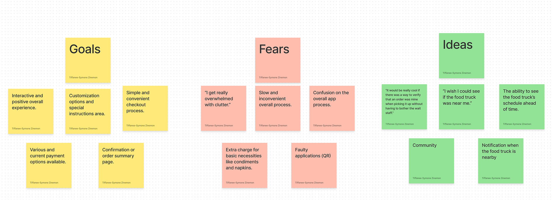
The time eventually came where all of the ideas and considerations were piling together and I needed to make sense of it all. In order to do this, I organized everything into an affinity map and categorized the listings under goals, fears, and ideas. This helped structure all of the influx of information I received during the research phase.
Understanding Users and Existing Products
After successfully organizing the influx of data I received via affinity mapping, I decided to further enhance my understanding on users needs and frustrations by creating a persona. This embodiment of all of the data I had collected helped put the user's conditions into perspective and assisted in being able to prioritize their needs.
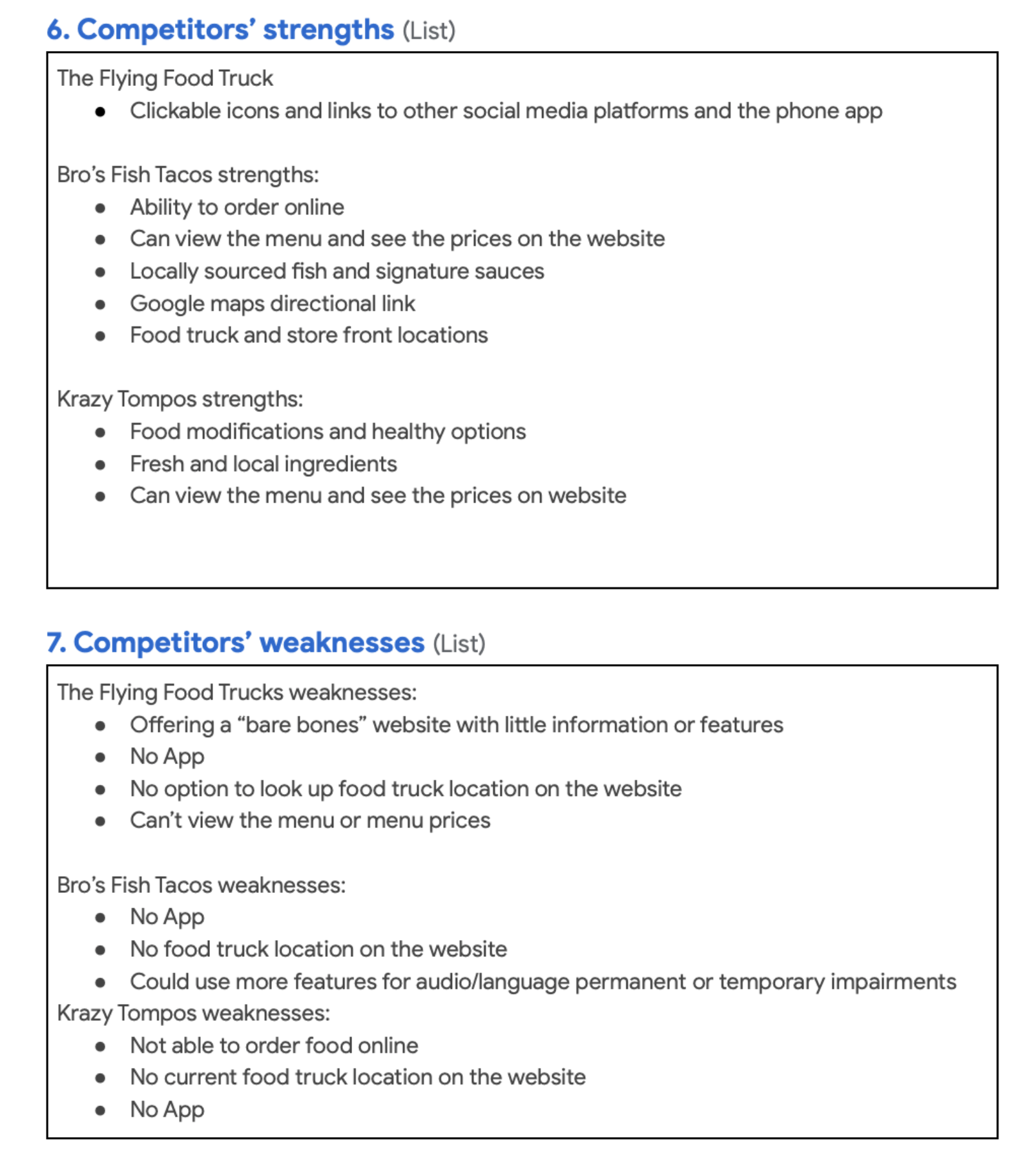
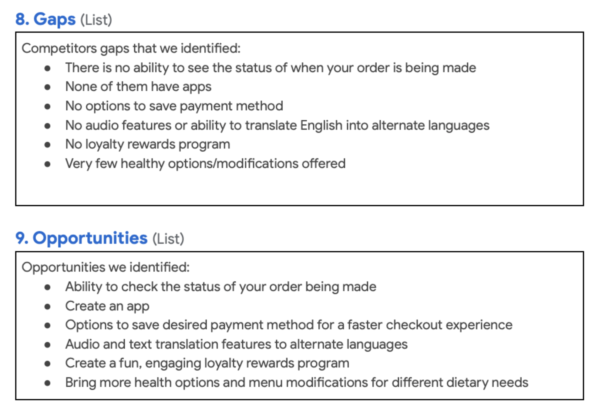
Next, I needed to know what businesses, products, or solutions already existed on the market and what they brought to the table for users. To do this, I worked on a competitive audit where I established 3 local competitors and looked into their business platforms. From my discovery, I included a few pages of the audit that I conducted below:
After all of the preliminary research was been completed, I was ready to step into the design phase. Almost. Before I begin this phase in most of my projects, I like to take a moment to think about my users and about what product might best serve their needs as well as how their journey might lookwithin said proposed product.
For this project, I quickly realized that the solution I designed would have to be on a mobile platform due to their level of importance in society, currently. Compared to the 90s, many more people have them and many different goals are completed more often on mobile than on desktop. I also chose an app as the digital solution due to apps having the ability to work offline, are easier to build, and have greater functionality.
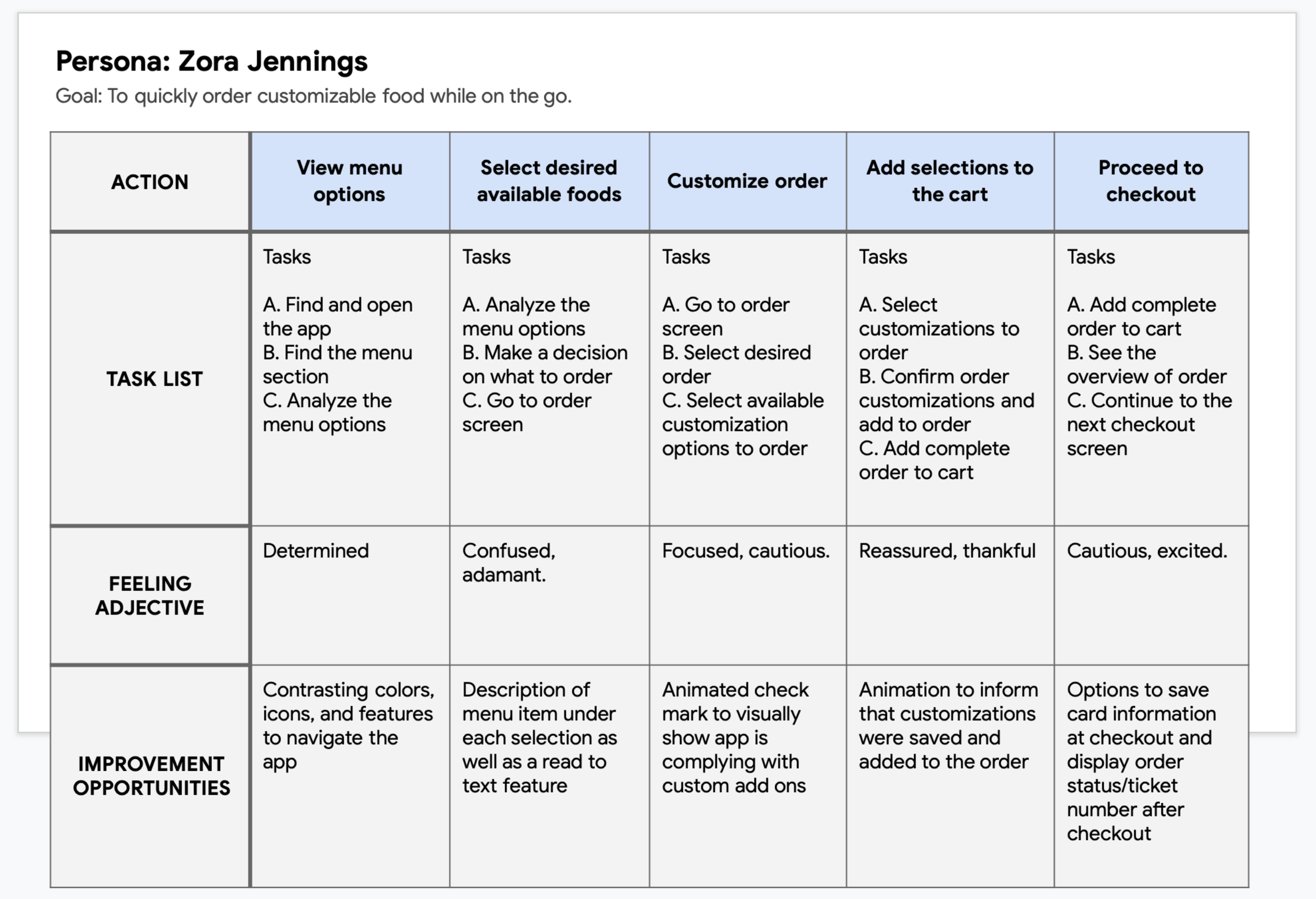
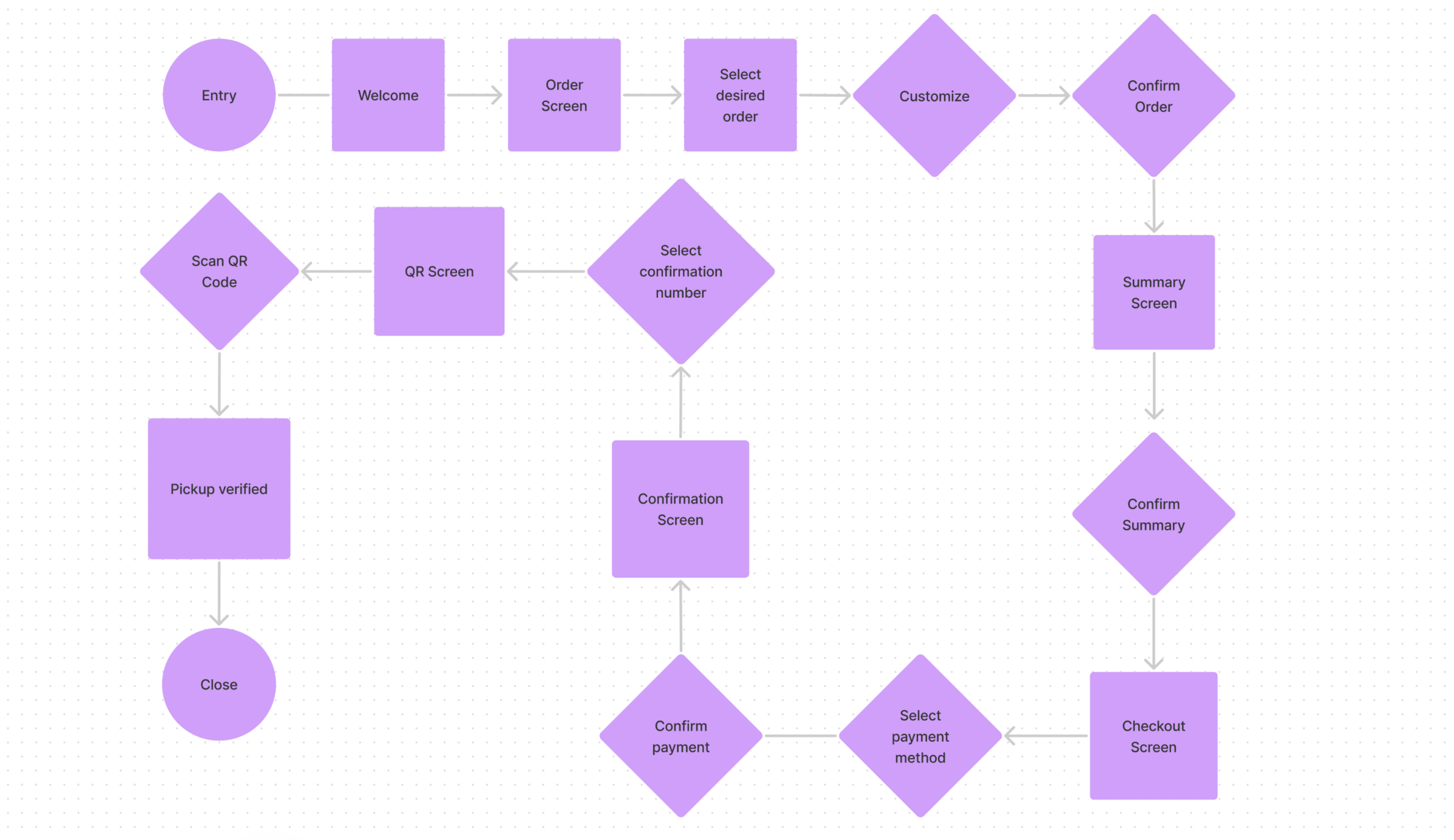
Entering the design stage, I became curious about a user's journey and how that might look like- this led to the creation of a journey map. I also created a task flow to establish a clear and concise manner that users would navigate through the mobile app experience from start to finish.
Designing the Journey
After establishing how the overall app experience would go, I began developing a multitude of different sketch variations of the entire mobile process. These sketches really helped me pull a ton of different ideas from my head and narrow down which one would be the most helpful to people using it and assisted in drafting design ideas that would help eliminate the users original pain points. Sketching out paper wireframes also really helps me eliminate wasted time when I begin digital wireframing because I already have an idea in place for what will be going on the screen.
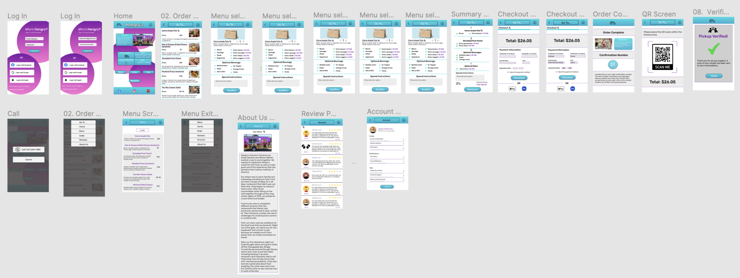
After sketching out some of my ideas, I began building wireframes digitally. This really helped me better understand how elements, text, and buttons engage with one another within the actual frame measurements that you are working in and caused further editing to the design. This process also helped me focus more on providing visual consistency across the user's journey.
Before I could sit down and begin brainstorming the hi-fi mockups, I needed to know what people thought of what I had created so far. Was I going in the right direction? Was there anything I overlooked? Could I have provided more options for potential users?
I knew that a usability test would be the way to get my answers. After my lo-fi prototype was created, I placed it in the hands of 3 potential users, where I received the following useful feedback:
Users wished for even more payment options than the "save this payment method" option.
Users wanted animations to demonstrate when they were successfully performing an action
Users became confused with the "Fan Faves" and "Reviews" buttons, believing they were the same information placed redundantly.
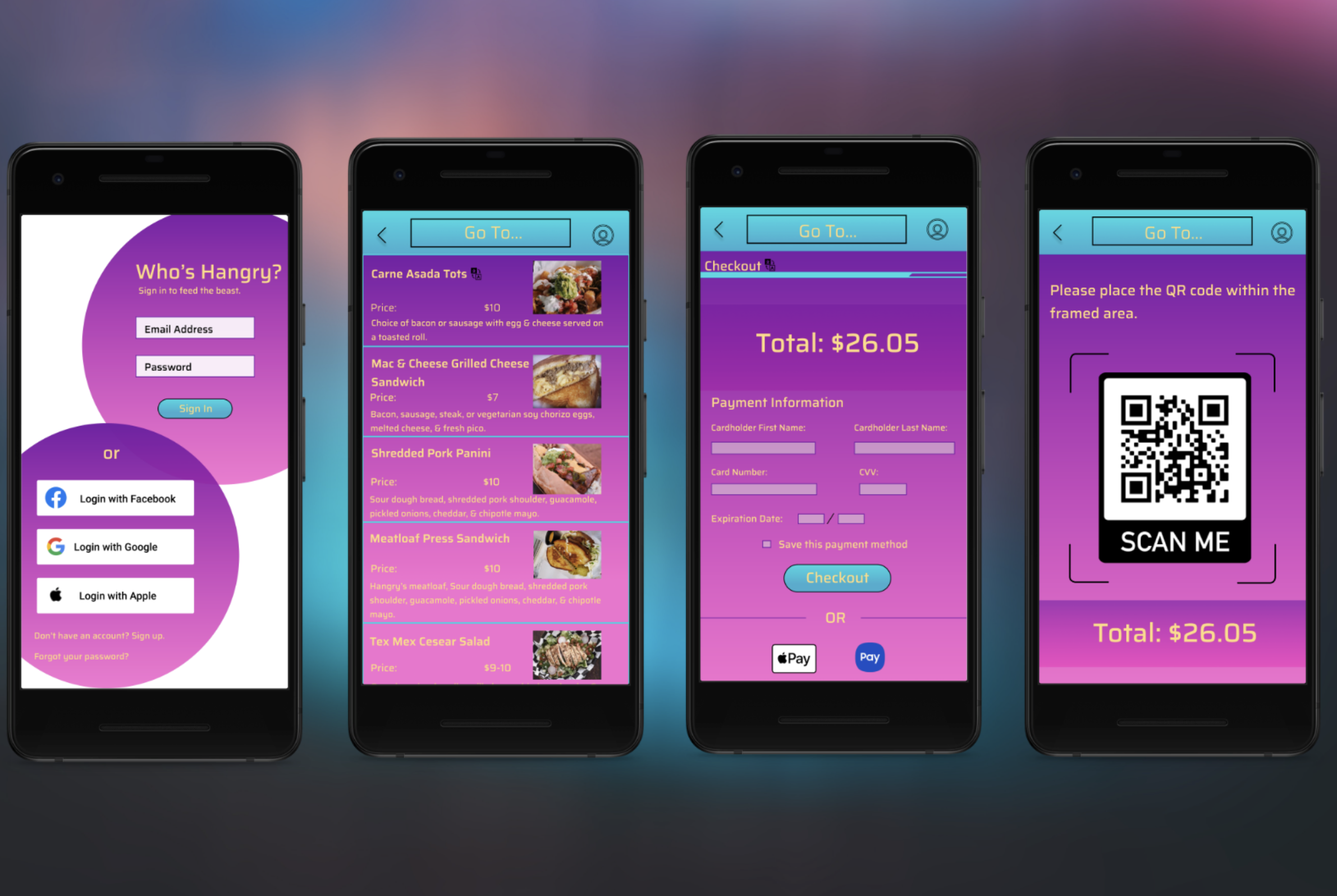
This led to the following hi-fi prototype mockup:
Usability Testing and Mockups
Initially, after creating my prototype, I thought I was near completion of my case study. There was one problem, however. Eventually, somewhere in the back of my head, I kept having this continual feeling that something was not quite right about my design. I knew I would get my answer the same way I had before-- by running another usability test. For my second trial, I used the hi-fi prototype that I had built and received the following vital feedback:
Users wanted the app's design to increase its overall contrast.
While the information may seem obvious and even transparent, it was an eye opening experience for myself. When going through the UI process of the initial prototype, I chose the colors due to the artwork on the physical food truck. I wanted the branding to be consistent across the board-- so much that I began to focus too much on the UI portion and not enough on the overall UX process. Because the app didn't have enough contrast in the overall design, it caused an issue with the apps clarity, readability, and accessibility. I failed to think about things such as people who may have permanent or temporary complications with their eyesight and could have a problem distinguishing content on the application. With this vital piece of feedback, I revamped the entire visual experience on the app to try and tackle those issues head on.
During this entire process, I learned many pivotal lessons that helped change the outcome of the overall design and user experience of this app. Here are the major takeaways that I learned over the course of this case study:
Don't overcomplicate the UI portion of the design.
Due to focusing too much on the design, I created an accessibility issue due to my original design not having enough contrast where people with permanent or temporary visual problems could have trouble using or navigating the app
Show animations based on performed actions.
This demonstrates to users that the action which they are trying to complete was done successfully.
Widen the scope of the study
Though the focus of this case study was creating a checkout process for Hangry's food truck and prioritizing customer needs, I would want to widen the scope to include the business and research/identify their needs as well to provide an amicable overall solution.
Takeaways
