Repair Boss
Rebuilding trust between tenants and property management.
“This app is really user-friendly and I like how I can find everything easily. I wish I had this back when I was renting.”
Project Background
Challenge: Renters around the country are facing growing frustrations with not having maintenance requests completed in a timely manner and poor communication from property management.
Solution: Created an app where maintenance requests could be placed, viewed, completed and kept on record for both tenants and property management.
Duration: 2 months.
My Role: User Researcher, Product Designer.
Artifacts: Flows, wireframes, prototypes, final design. Research included, usability testing, and persona creation.
Tools: Figma, Keynote, Procreate, Survey Monkey.
My Design Process
Renters around the country are facing growing frustrations with not having maintenance requests completed in a timely manner and poor communication from property management.
The Problem
Without properly addressing these frustrations, tenants are starting to develop marred feelings towards property management and are considering not renewing their lease in hopes of finding a new complex that is more organized, communicative, transparent, and time sensitive. This can pose as a problem for both parties involved due to the tenant needing to spend time and resources in finding a new place to live; The property manager would be
Why is this a problem?
To truly understand the pain points of both user groups, I conducted a survey for tenants that over 50 participants engaged in as well as user interviews with 4 individuals who worked within property maintenance.
While conducting my user research, I gained insight from the perspective of tenants and property staff workers:
57.47% of them have experienced some form of issues while renting— maintenance related issues being a common theme
The major pain points which tenants deal with include long wait times for repairs, disorganization, and a lack of communication.
Tenants are wary that they might face unexpected fees and charges due to maintenance requests not being handled in a timely manner.
"Right now, there's no solid system in place for that (prioritizing maintenance requests). It's up to the workers to kind of juggle the workload and make it work." (Quote from interviewee)
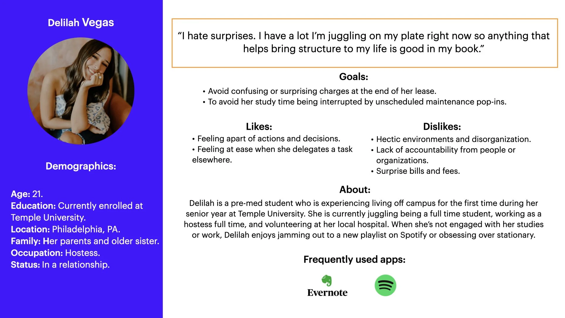
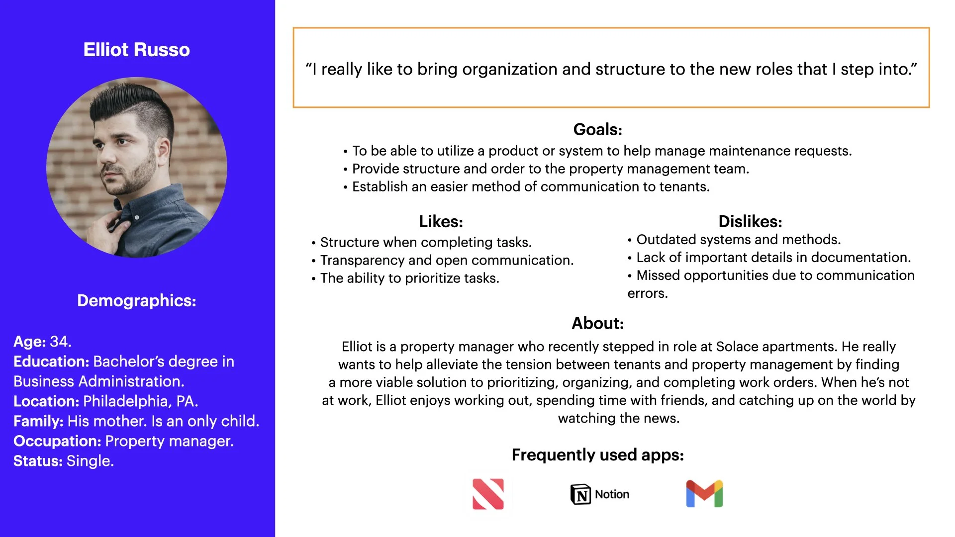
From my research, I spent time understanding users on a deeper level by creating 2 personas to represent each party— one for the business (property management) and another for their customers (the tenants).
Initial Research
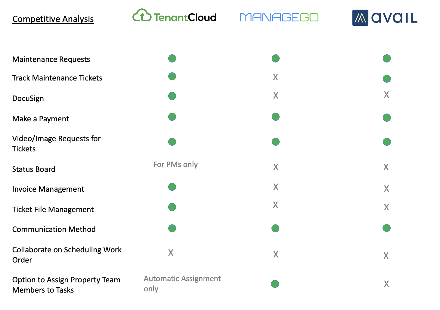
After understanding each party and their needs, I took time to investigate available products on the market by completing a competitive audit. The analysis of this audit allowed me to ask myself: how can we distinguish our product from what's already available on the market?
From my findings, I extracted common themes such as: tenants not wanting to face unexpected fees at the end of their lease and the original idea of creating a product that would balance the relationship between property management and tenants. From those themes, I curated the following ideas (and implemented them in the wireframes/prototypes):
The ability for the app to provide and hold digital documents of the initial and final walk-through.
These documents are typically essential because they document the condition of units when tenants first move in and move out. This would be beneficial for both management and renters.
The ability for tenants to confirm a date for maintenance repairs
This helps tenants feel like they are in the loop and are not left feeling surprised or like their home is being intruded upon with maintenance staff making sudden appearances.
Common Themes
An important aspect of my process to sketch low fidelity wireframes of different screens to get all my ideas out on paper. This allows room to release all of my design variations quickly and efficiently before creating anything digital.
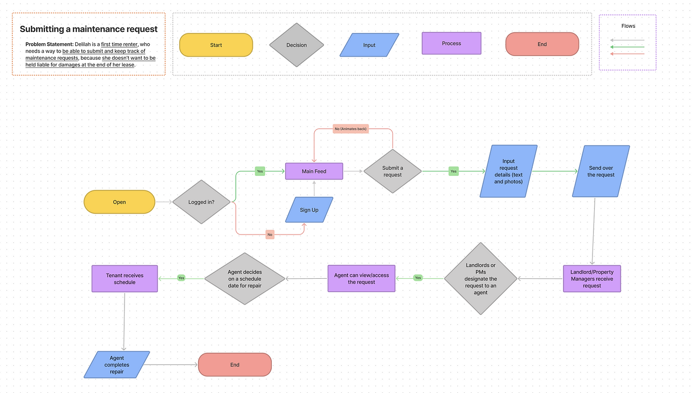
Next, I focused on configuring the bird's eye view of the entire digital experience with a task flow. This helps solidify the structure of the product that is being worked on.
Generating Ideas
Once I understood the direction I planned to go in with my designs, I moved on to creating digital low fidelity wireframes.
Digitizing the Solution
After creating the low fidelity wireframes, I made the decision to go through some user testing to gain further insights on if the maintenance tool created was a viable solution. I ran an unmoderated usability test where 5 participants were able to provide the following feedback:
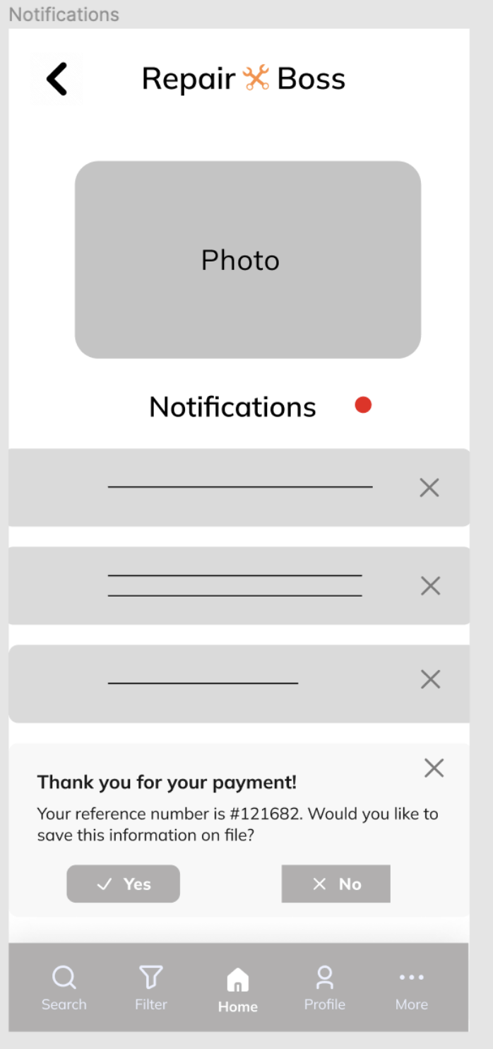
Edit or remove the yes/no button from the notification page.
Make the notification page more distinguishable so users can transition to the next page (button).
Users have inquired "How are requests visibly prioritized?"
Testing Solutions
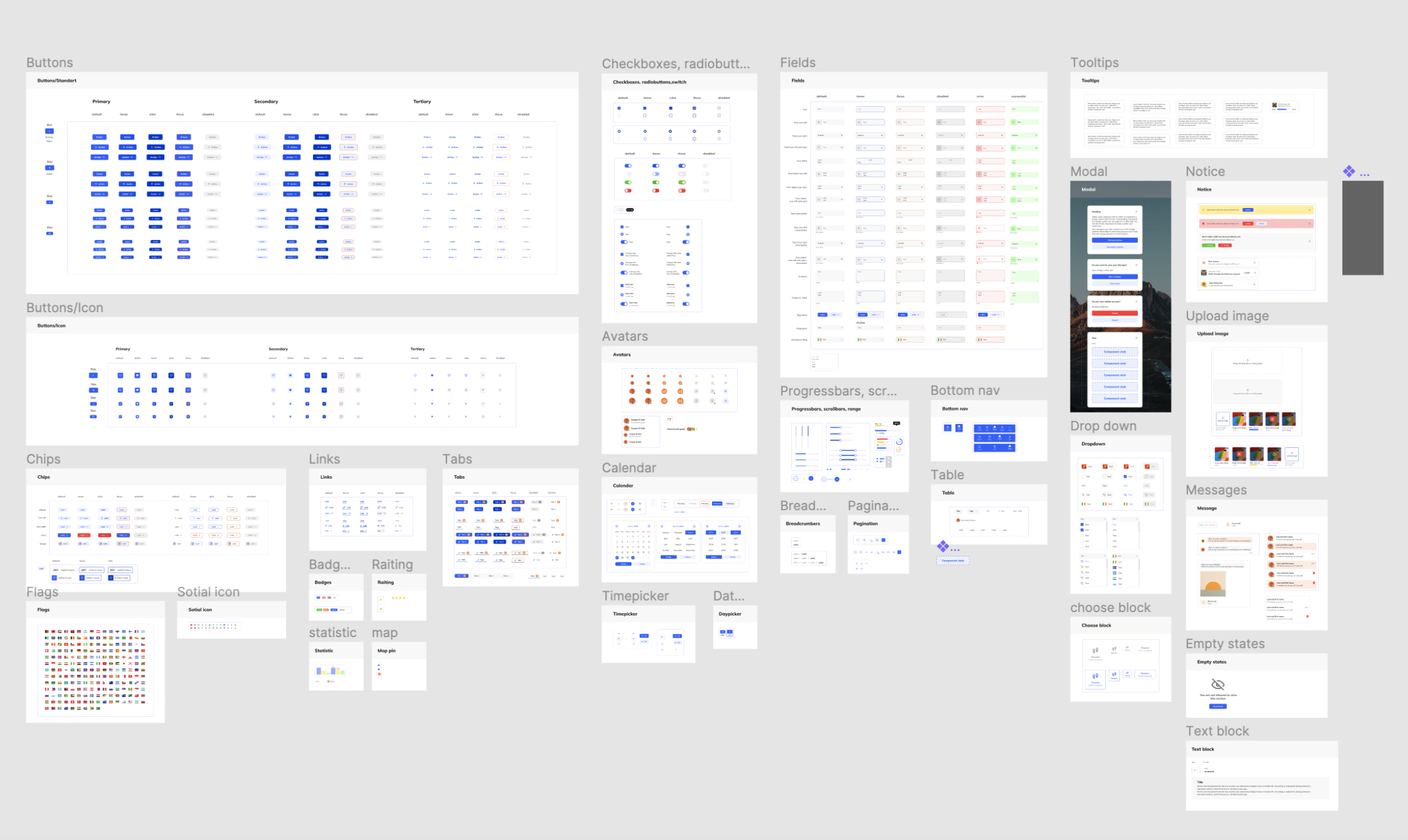
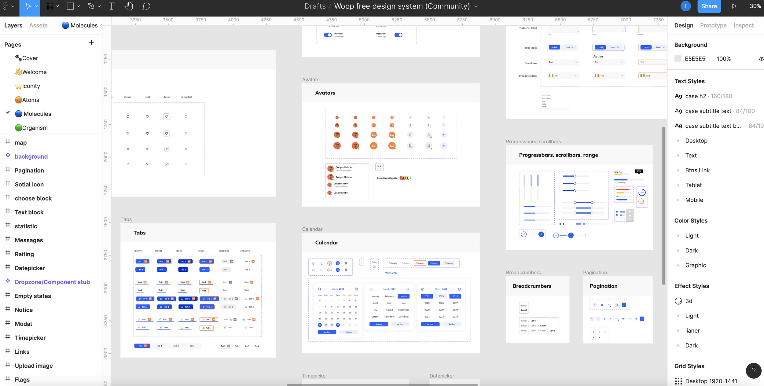
After assessing the feedback from users during the testing phase, I made some tweaks to the maintenance tool before beginning to make visual design decisions. During this time, I focused on choosing color schemes, understanding the reasoning of why I chose said colors, and utilized a design system via Figma. This work was truly a labor of love but most importantly being able to create of a tool that bridged the relationship gap between disgruntled tenants and property management was an invigorating experience.
Establishing the Visual Identity
Images of the design system plugin utilized for the visual design of the Repair Boss App.
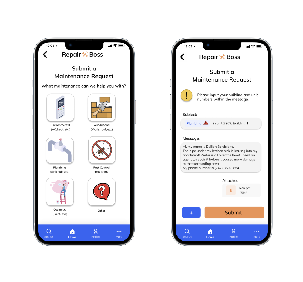
High-fidelity images of the tenant experience of the Repair Boss App.
High-fidelity images of the property management experience of the Repair Boss App.
With the creation of this maintenance request app, both user groups were satisfied. Staff felt better equipped to do their jobs while tenants felt more at ease due to readily available information at their fingertips. I obtained a testimonial from one of the users who stated: “This app is really user friendly and I like how I can find everything easily. I wish I had this back when I was renting.”
The average completion time for navigating through the app’s digital experience is 2 minutes and 2 seconds.
The Results
It's important, as a designer, to think about methods users can utilize to reduce the possibility of human error.
Including features that are beneficial to both users (tenants and property management) allowed for a better overall solution and resulted in a product that differed from its competitors.
Takeaways


